
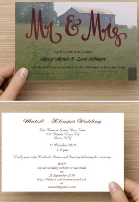
Post content has been hidden

To unblock this content, please click here

Macee
Dedicated October 2019

Opinion on Invitation

Macee, on June 5, 2019 at 3:14 PM Posted in Do It Yourself 0 11
Hi all, please let me know what you think of these invitations that I designed through Vistaprint.

Opinion on Invitation 1

11 Comments

Latest activity by Sinéad, on June 7, 2019 at 10:49 AM
  • MrsD
    Legend July 2019
    MrsD ·
    • Flag
    • Hide content

    I can't see it super well, but it looks great to me!

    • Reply
  • M
    Legend June 2019
    Melle ·
    • Flag
    • Hide content

    Looks ok to me design wise Smiley smile

    i love love the font of the mr and mrs

    • Reply
  • Cher Horowitz
    Master December 2019
    Cher Horowitz ·
    • Flag
    • Hide content

    They're beautiful! You did a fantastic job

    • Reply
  • SummerBrideInAutumn
    VIP October 2019
    SummerBrideInAutumn ·
    • Flag
    • Hide content
    Hey date twin! Looks good to me.
    • Reply
  • Macee
    Dedicated October 2019
    Macee ·
    • Flag
    • Hide content
    Haha. It's a good date. Thanks all! I wanted to keep it simple and the photo is a barn my fh took while out and about at work. We have a simple rustic theme and I didn't want to do RSVP cards, I've put all the info on the website for guests.
    • Reply
  • Chandra
    Master May 2019
    Chandra ·
    • Flag
    • Hide content
    I would make the black text on the picture side white to help it pop a bit more.
    And maybe try to put "by" on the line before (the one that ends in via email)? It just looks funny to me by its lonesome.
    • Reply
  • SraDeCarrillo
    Super August 2019
    SraDeCarrillo ·
    • Flag
    • Hide content

    I made mine and uploaded them to vista print too for printing. Such a good way to save money! I did two cards though. I had pictures of us on one side and invite info on the back side. Then my second (smaller) card had the info for the RSVP online and wedding website. I had to write everything in two languages though so one card wasn’t enough for everything. I even thought of using a business card for the wedding website and email address but I couldn’t fit everything in two languages on one business card.

    If I were doing your invites I would try to put the full invitation on one side and the RSVP and details on the back side.

    • Reply
  • Tris
    Expert August 2019
    Tris ·
    • Flag
    • Hide content
    I wonder how it would look if the black print on the front was white.

    I also think they would look better if you stuck to 2 fonts at the most. Play around with that, the fonts you've chosen don't really mesh well and are hard to read.

    Simplify the colors on the back and remove the RSVP info. Include a details card for that info.

    This is a great start though! They are gonna be super cute.
    • Reply
  • Macee
    Dedicated October 2019
    Macee ·
    • Flag
    • Hide content
    View Quoted Comment
    Your suggestions are great!

    Opinion on Invitation 2

    Opinion on Invitation 3
    • Reply
  • Chandra
    Master May 2019
    Chandra ·
    • Flag
    • Hide content
    View Quoted Comment
    Looks good!!! The white text really helps! Smiley laugh
    • Reply
  • Sinéad
    WeddingWire Administrator January 2025
    Sinéad ·
    • Flag
    • Hide content
    View Quoted Comment

    They look great Macee!! The white text is much easier to readSmiley laugh

    • Reply

You voted for . Add a comment 👇

×

Related articles

WeddingWire celebrates love ...and so does everyone on our site! Learn more

Groups

WeddingWire article topics