
Post content has been hidden

To unblock this content, please click here

Kari
Master May 2020

My Moh's Dress! + New David's Colors

Kari, on January 18, 2020 at 4:41 PM Posted in Wedding Attire 2 11

If you've tried looking at photoshopped colors for bridesmaids dresses on David's Bridals website and then seen the dresses in person you'll know the photoshop color usually isn't that accurate. My MOH just ordered her dress and she's going with the dress on the right (with the blue arrow).

David's Sedona (left) in charmeuse and Desert Coral (right) in chiffonMy Moh's Dress! + New David's Colors 1


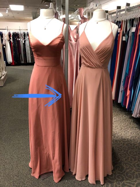
If anyone was wondering what the new colors "Sedona" and "Desert Coral" look like, here you go. David's "Ballet" was originally the closest match to the color scheme we wanted for our wedding (dusty rose), but my MOH is fair skinned and preferred the slight coral undertones of the Desert Coral a lot better because she felt it didn't wash her out as much. Ballet is a bit pinker and paler by comparison (not quite as deep and dusty of a rose as we were going for, but the closest match they had). The new colors are really pretty!


11 Comments

Latest activity by Cassidy, on January 23, 2021 at 2:03 AM
  • Erin
    Devoted September 2021
    Erin ·
    • Flag
    • Hide content
    That dress on the right is gorgeous!!
    • Reply
  • Kari
    Master May 2020
    Kari ·
    • Flag
    • Hide content
    View Quoted Comment

    Agreed! She originally wanted a different style but I took this photo of the color on the mannequin and sent it to her because "Desert Coral" is new and they only had this and one other dress in the store in this color. When she was showing it to her girlfriends at work they all liked this style better than the other one she was looking at. She went back and tried it on and said it was the clear winner. I'm happy because I like this style better too, but I wanted her to be comfortable so was fine if she went with her first choice. We all win!

    • Reply
  • Noelle
    Expert November 2019
    Noelle ·
    • Flag
    • Hide content
    I love both of those colors!
    • Reply
  • Clíodhna
    WeddingWire Administrator January 2030
    Clíodhna ·
    • Flag
    • Hide content

    She picked a gorgeous color. It’s great to be able to see them in person!

    • Reply
  • C
    Just Said Yes July 2020
    Chelsey ·
    • Flag
    • Hide content
    Would you say the desert coral is similar to a pale pink in person? I have a color swatch but my fiance thinks it looks more like a burnt orange or brown.
    • Reply
  • Kari
    Master May 2020
    Kari ·
    • Flag
    • Hide content
    View Quoted Comment

    The photo above is pretty accurate on my monitor. I'd describe Desert Coral as a dusty coral or muted darker peachy-pink. It similar warm/salmon undertones to a bright coral dress would, but has a softer, more muted and subdued look overall and is a less saturated, intense color. It's not a true pink at all, but would go well with pinks as part of a mismatched bridesmaids look. Really think of it as the color coral (orangey-pink, but more pink than orange), just softer and less saturated.


    I was originally going to have my MOH in David's "Ballet" but that's more of a true pink and she felt the Desert Coral was more flattering for her skin tone. Ballet was the closest match to the pink floral tie we had (which was like a dusty pink/dark blush color), and when I held the Ballet and Desert Coral colors together they were similar enough that they looked really cohesive together and coordinated well, so I let her go with the option she liked best. You could easily put David's Petal (blush/soft pink), Ballet (rose/dusty pink), Desert Coral (dusty coral), and Sedona (rusty coral) all together and have it look cohesive, so even though I wouldn't call it a true pink I think it fits well within a peachy-pink color scheme. I think it could also work with David's Chianti and more wine-pink colors as well, or champagne or rose gold colored dresses. It's a very pretty color and quite versatile!

    Both my MOH and I are both fair skinned with cool undertones, blond hair, and light eyes, and this color was really flattering and worked a bit better than the other soft David's "pink family" colors, as those washed out lighter skin tones a bit more. I know orange is an awful color on me, but corals are usually quite flattering and I can wear a variety of pink shades as well. If pressed to put this in a color family of standard colors, I would definitely call it pink before I would call it orange or brown, and I think most would agree with me.


    I hope that helps!

    • Reply
  • Mrs.hays
    VIP April 2018
    Mrs.hays ·
    • Flag
    • Hide content
    Those are beautiful colors!
    • Reply
  • Danielle
    Expert November 2020
    Danielle ·
    • Flag
    • Hide content

    Both look very nice.

    • Reply
  • Cassidy
    Just Said Yes April 2022
    Cassidy ·
    • Flag
    • Hide content
    Hi! I love these two colors together! I’m trying to pick between these and “Cinnamon” for my bridesmaids. I was wondering how these dresses came out in the pictures? Like if they stayed true to color? I’ve been seeing a lot of color differences between in person and online so I was just wondering how they looked.
    • Reply
  • Kari
    Master May 2020
    Kari ·
    • Flag
    • Hide content
    View Quoted Comment

    Covid ruined our wedding - my MOH's dress didn't come in time and we ended up having a micro-ceremony so never got to see the dresses outside the store ever.

    I am a photographer though so will say that lighting and your photographers processing style will impact how they turn out in photos. They'll look warmer (more orange) in direct sunlight at sunrise and sunset, likely a little cooler (more pink) indoors in soft diffused daylight, and artificial light can influence the colors in a variety of ways. Also your photographers editing style will impact the colors as well - expect them to look brighter and cooler if your photographer uses a bright, whimsical processing style and a bit darker and more golden if your photographer leans towards warm and moody images. I think both colors are very pretty and compliment each other well, so regardless of the lighting or processing style they should always have a similar relationship towards each other and work in a mismatched bridesmaids color palette. I hope that is helpful!

    • Reply
  • Cassidy
    Just Said Yes April 2022
    Cassidy ·
    • Flag
    • Hide content
    View Quoted Comment
    Hi! Thank you, this definitely helps!
    • Reply

You voted for . Add a comment 👇

×

Related articles

WeddingWire celebrates love ...and so does everyone on our site! Learn more

Groups

WeddingWire article topics